Design
Designing Food Packaging That Photographs Well
Your customers photograph your food more than you do. Four packaging decisions determine whether those photographs help you.
Published February 14, 2026 · About 9 minutes to read
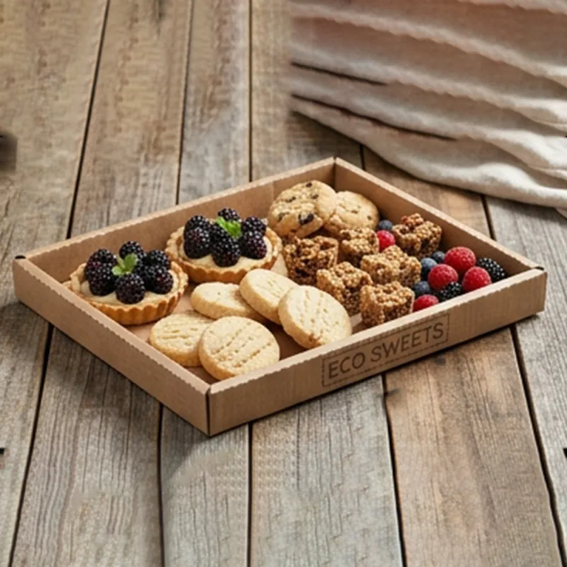
For most food businesses, the majority of photographs of their product are taken by customers, on phones, in poor light, and posted publicly. That makes the packaging a permanent, unpaid part of your visual marketing — and it means a few small specification decisions have a disproportionate effect on how your food looks online.
The four decisions
Matt, not gloss
This is the big one. A gloss surface reflects whatever light is above it: a ring light in a studio, a ceiling light in a restaurant, a window in a kitchen. The result is a bright streak across the packaging, blown-out highlights, and every fingerprint made visible.
Matt eliminates all of it and costs the same or less. If you change one thing after reading this, change this one.
Background colour against your food
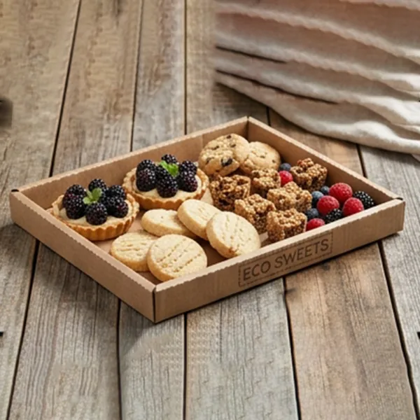
Dark backgrounds flatter pale food: cheese, charcuterie, pastry, seafood. Light backgrounds flatter dark and colourful food: chocolate, curry, berries, salad. Kraft flatters anything golden and rustic.
The way to decide is not to consult a colour theory chart. Build your product on three different backgrounds, photograph all three in your normal light, and look at them.
A visible border
A tray with a margin of clear space around the food reads as composed. One filled to the edges reads as crowded, even when it contains more. This is why a slightly larger tray with the same portion often photographs better than a snug one.
Branding where it survives
The centre of any tray is covered by food within seconds. Branding on the rim, the side wall, the lid or a band is what actually appears in a photograph of the finished product.
Background colour by food type
Starting points. Your own photographs are the real evidence.
| Food | Best background | Why |
|---|---|---|
| Cheese and charcuterie | Matt black | Pale food needs contrast to read |
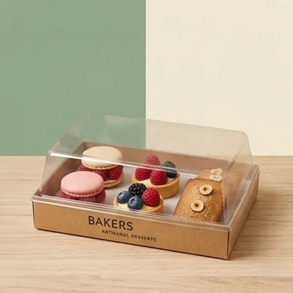
| Patisserie and macarons | Matt black or white | Depends on how colourful the range is |
| Bread and rustic bakes | Natural kraft | Warm tone complements the crust |
| Fried food | White or kraft | Golden food reads well on both |
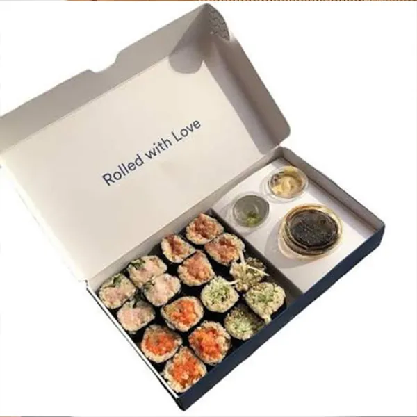
| Sushi and sashimi | Kraft or dark, with texture | Texture contrasts with geometric arrangement |
| Salads and colourful bowls | White or kraft | Lets the produce colours carry the image |
| Chocolate and dark desserts | White | Dark on dark loses all definition |
Smaller things that add up
- A clean edge. A raw cut edge showing a grey board core is visible at close range and reads as cheap.
- Avoid busy printed patterns under the food — they compete with it in a photograph.
- Interior print appears in every photograph of an opened box, which is where most food photography happens.
- Consistent packaging across your range makes a feed look deliberate rather than accumulated.
- A tray that stays flat matters: a bowed base makes an arrangement look crooked in a photograph.
The test that settles it
Build your best-selling product on kraft, on matt white and on matt black card. Photograph all three, in the light you actually have, on the phone you actually use. Post them to your team and ask which one they would use.
This takes twenty minutes and produces a better decision than any amount of theory, because it uses your food, your lighting and your eye. It also frequently overturns an assumption — plenty of businesses discover their food looks better on kraft than on the premium black they were about to commission.
One more thing worth knowing: matt and gloss usually cost the same. Choosing matt is not a premium upgrade, it is a specification choice — and on a product that gets photographed, it is almost always the right one.
Where this matters most
No sector depends on this more than grazing, where customers buy almost entirely from images. The guide for grazing businesses covers the rigidity and finish decisions that follow.
Quick answers
Does matt packaging cost more than gloss?
Generally no — they are comparable. Matt is a specification choice rather than an upgrade, which makes it one of the cheapest improvements available on a product that gets photographed.
Should everything be black?
No. Black flatters pale food and loses dark food entirely. Chocolate on a black tray disappears. Match the background to what you actually sell, and test it with your own photographs.
Where should the logo go if the food covers the tray?
The rim, the side wall, the lid or a paper band. The centre is covered within seconds of the tray being filled, so branding there does not appear in any photograph of the finished product.